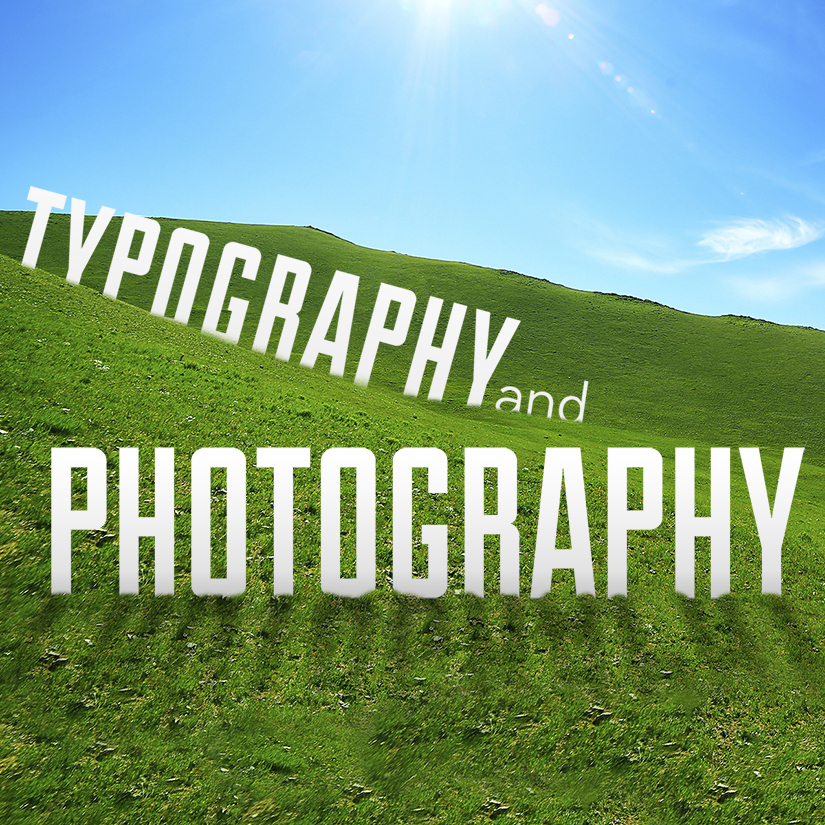
Getting your information out through Social Media is made easier with pictures and words. It’s easy to share and get interaction.
This article covers some of the methods to put them together without looking like it was just typed into the picture.
As I am not very good at this type of overlay and I don’t run photoshop I like that he included a method in Powerpoint.
The Right Way to Incorporate Typography with Photography

Here are few simple rules to take your presentations to the next level:
Add An Extra Layer
An easy way to spruce up a presentation is to place your text on top of a beautiful, full-bleed photograph. However, this can be problematic when using a full-color photograph due to all the different colors in the photo. If the photograph is saturated with light colors, light text might get too washed out, but dark text might contrast too much and look odd. An easy solution is to add a translucent color overlay to the photo, and then add the text. This adds enough contrast for the text to standout, while still allowing for an interesting, engaging background photo.
This can be done in PowerPoint by simply adding a shape on top of a photo, making the shape a dark color (black works well), placing it where you want your text to go, and then increasing the transparency of the shape so that you can still see the image underneath.
Here’s a sample.

Make the Words Part of the Scene
Another great way to use typography is to add it to a photograph in a way that makes it seem like part of the scene. This is a little advanced and best accomplished in Photoshop, but it yields some amazing results. Simply find an image you would like to use (preferably one with a definite foreground and background), and then add your text and place it onto an item in the foreground, as if it’s peeking out of the object. Next, erase the area that overlaps the foreground object. This hides that section of text and makes it seems like the text is behind the foreground object and in front of the background.
It should look something like this when you are done:

It’s All About Perspective
Another way to incorporate text into your photo is by using the perspective tool in Photoshop. This allows you to adjust the text in a way that makes it seem as if it’s being viewed from the angle of the camera, not just flat on the screen. If you have Photoshop, this is an easy one. Once you’ve chosen your photo, just add your text, select it in the Layer Panel, right-click the layer and convert the text to a Smart Object. With the Text Object selected, go to Edit > Transform > Perspective (or use shortcut command+T) then just grab a corner and drag it until the text is positioned in your desired perspective. It’s that simple.
You should then have something similar to this example:

If you have any comments please post them below.
To Your Prosperity
Ken Barrett

P.S You can find this and my other comments at KenBarrett.us
P.P.S Are you a business and need to improve your online presence? Maybe I can help START HERE


